
Top Kitchen Color Ideas
The best kitchen color ideas balance appearance, natural light, existing finishes, and everyday practicality. A successful palette should connect the cabinets, walls, countertops, backsplash, flooring, and hardware without making the room feel overly coordinated.
White and warm neutral shades can make a compact kitchen feel more open, while blue, green, charcoal, and natural wood introduce depth and personality. The right choice depends less on a single fashionable shade and more on how the complete combination works in the room.
How Color Changes the Look of a Kitchen
Color affects more than decoration. It can influence how spacious, bright, warm, or visually organized a kitchen appears.
Lighter finishes reflect more available light and can reduce the visual weight of large cabinets. Deeper tones create contrast and may make an open kitchen feel more defined. Warm shades tend to produce a welcoming atmosphere, while cooler colors can give the room a crisp and restrained character.
The finish also matters. Glossy surfaces reflect light and draw attention, whereas matte and satin finishes usually create a softer effect. Texture, wood grain, veining, and metal accents can change how the same paint color looks in different kitchens.
If you are also planning changes to the room’s layout or finishes, see our guide to
kitchen upgrade options.
Where to Start Your Kitchen Color Palette
Before selecting paint, identify the elements that are staying in the room. Flooring, countertops, appliances, and permanent backsplash tiles can limit or guide the palette because they are generally more difficult and expensive to replace.
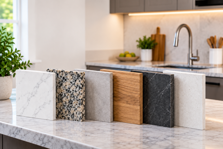
Choose one fixed surface as the starting point. A stone countertop, for example, may contain several undertones that can help you select cabinet and wall colors. A warm cream, brown, or gold vein usually works best with similarly warm finishes, while blue-gray or crisp white veining may suit cooler combinations.
A simple kitchen palette often includes:
- One main color for cabinets or walls
- One supporting neutral for large surrounding surfaces
- One accent finish for the island, backsplash, stools, lighting, or accessories
This approach provides variety without introducing too many competing colors.
Kitchen Wall Color Ideas
Wall color acts as the background for cabinets, countertops, and appliances. The best choice should support those features rather than compete with them.
Warm White
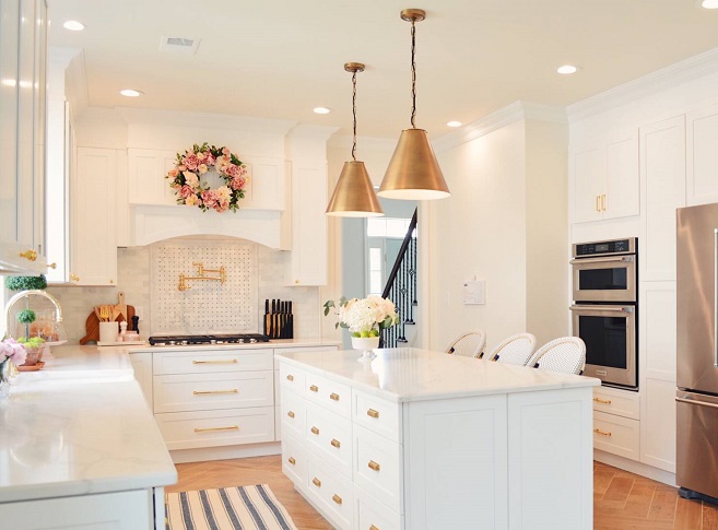
Warm white can brighten the kitchen without creating a stark or clinical appearance. It works especially well with wood cabinets, cream stone, brass hardware, and earthy tiles.
Soft Greige
A restrained blend of gray and beige offers more depth than white while remaining versatile. Greige can connect warm flooring with cooler stainless-steel appliances when its undertone is chosen carefully.
Muted Blue
Dusty blue, blue-gray, and misty shades can create a relaxed atmosphere. They pair naturally with white cabinetry, pale wood, marble-style surfaces, and brushed metal.
Sage Green
Sage introduces color while remaining relatively easy to coordinate. It complements natural wood, stone, terracotta, warm white, and aged metal finishes.
Soft Clay or Taupe
Clay-inspired neutrals and taupe can make a kitchen feel warmer and more grounded. They are useful in rooms where plain white looks too cold against the existing floor or countertop.
Apply wall samples beside the cabinets and backsplash. A shade that looks neutral on a small card may reveal green, pink, yellow, or blue undertones once it covers a larger area.
Kitchen Cabinet Color Ideas
Cabinets occupy a large amount of visual space, so their color usually has a stronger impact than wall paint. Consider the cabinet style, the amount of daylight, and the maintenance requirements of the finish.
White and Off-White Cabinets
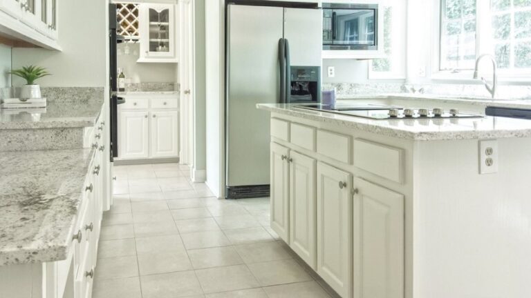
White remains flexible and can visually lighten a room. Softer ivory and off-white finishes often sit more comfortably beside warm flooring and natural wood than a very bright white.
Natural Wood Cabinets
Oak, walnut, ash, and other visible wood grains introduce warmth and texture without relying on a painted color. Wood can be used throughout the kitchen or combined with painted upper or lower cabinets.
Blue Cabinets
Navy creates a strong focal point, while smoky or muted blue provides a gentler result. Blue cabinetry often works well with pale countertops, wood accents, and warm metal hardware.
Green Cabinets
Sage, olive, and forest-inspired finishes can range from quiet to dramatic. Muted greens are easier to use across an entire kitchen, while deeper shades may be more effective on lower cabinets or an island.
Charcoal Cabinets
Charcoal offers definition without the intensity of pure black. It can suit contemporary and industrial interiors, particularly when balanced with a light backsplash, reflective surfaces, and adequate lighting.
Two-Tone Cabinets
Using one color for upper cabinets and another for the base units can reduce visual heaviness. A common approach combines light upper cabinets with darker lower storage, helping the top half of the room feel more open.
For layout, storage, and finish inspiration, explore our
modern kitchen design ideas.
Kitchen Color Combinations That Work Well
A good combination creates contrast while repeating enough tones or materials to keep the room connected.
Warm White, Natural Wood, and Black
Warm white provides a bright background, wood adds texture, and restrained black details introduce definition. Black can appear through handles, window frames, lighting, or stools rather than covering a large surface.
Sage Green, Cream, and Brass
This combination feels soft and welcoming. Cream prevents the green from becoming too cool, while brass or aged bronze adds a warmer detail.
Navy, White, and Pale Wood
Navy creates depth, white keeps the palette fresh, and pale wood reduces the formality of the contrast. This scheme can work on cabinetry, an island, or a limited feature area.
Greige, Walnut, and Brushed Metal
Greige provides a calm base for the richer appearance of walnut. Brushed nickel or stainless steel can connect the palette with modern appliances.
Charcoal, Warm Wood, and Soft Beige
Charcoal adds structure, but the surrounding wood and beige surfaces keep the space from feeling severe. This combination benefits from layered task and ambient lighting.
White, Soft Blue, and Sandy Neutrals
This light combination can create an airy interior without relying on plain white alone. It works particularly well in kitchens with generous daylight and simple cabinet profiles.
Using Color on a Kitchen Island
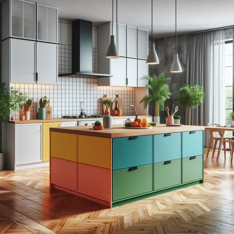
A kitchen island offers a practical place to introduce a stronger shade without repainting every cabinet. It can act as a visual anchor and help distinguish the work area in an open-plan room.
Possible island colors include:
- Deep blue with white perimeter cabinets
- Muted green with warm wood or cream cabinetry
- Charcoal with pale walls and countertops
- Terracotta or brick red in an earthy kitchen
- Natural wood against painted cabinets
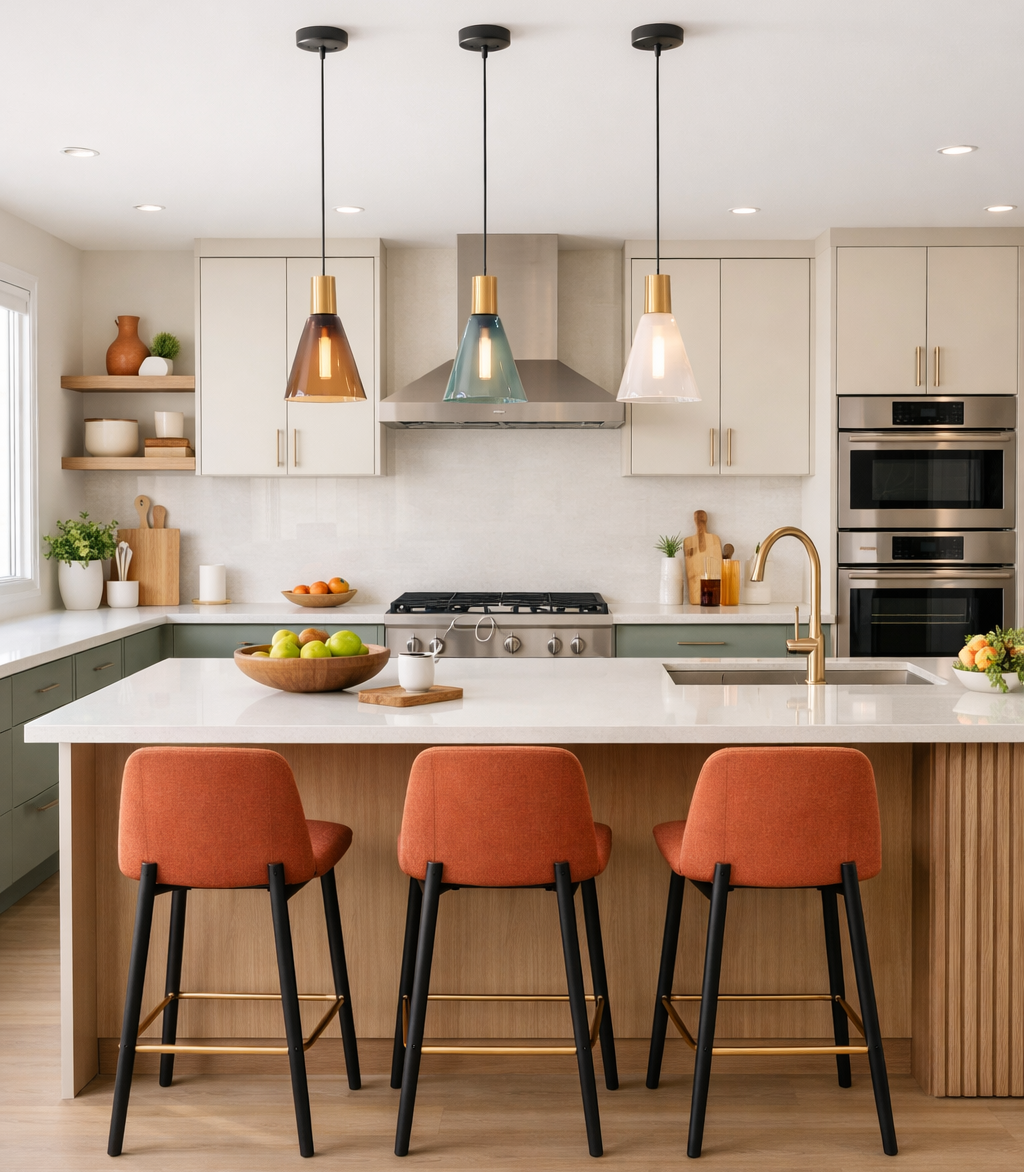
Repeat the island color or its undertone elsewhere in a small way, such as in a pendant light, textile, framed print, or backsplash detail. This prevents the island from looking disconnected from the rest of the room.
See more examples in our guide to
colorful kitchen islands with wood countertops.
Choosing Colors for Your Kitchen Style
Modern Kitchens
Warm white, greige, charcoal, muted blue, and natural wood support clean lines and restrained detailing. A limited palette helps the cabinetry and architecture remain visually clear.
Traditional Kitchens
Cream, warm white, soft gray, deep blue, and muted green complement framed cabinet doors, decorative molding, stone countertops, and classic hardware.
Rustic Kitchens
Earthy green, clay, warm beige, brown, and visible wood grain work naturally with textured stone, timber beams, handmade tiles, and aged finishes.
Coastal-Inspired Kitchens
Soft blue, sea-glass green, sandy beige, white, and light wood can create an open, relaxed atmosphere. Keep themed accessories limited so the design remains adaptable.
Industrial Kitchens
Charcoal, concrete gray, black, brick tones, and medium or dark wood suit metal details and exposed structural materials. Lighter walls and warm illumination can prevent the palette from becoming overly heavy.
For more ways to coordinate materials and finishes, visit our article about
kitchen design trends.
How Room Size and Natural Light Affect Color
Room size can influence a color decision, but it should not be the only factor. A compact kitchen can still use a rich cabinet color if the layout is simple and the surrounding surfaces provide enough balance.
Small Kitchens
Light upper cabinets, a restrained wall color, and limited contrast can reduce visual clutter. If you want a deeper shade, consider using it on the lower cabinets, island, or a single feature area.
More space-saving ideas are available in our guide to
small modern kitchens.
North-Facing or Low-Light Kitchens
Cool daylight may make blue-gray paint appear colder than expected. Warm whites, muted beige, taupe, soft clay, and gentle greens can provide balance, although every sample should be evaluated in the actual room.
Bright, Sunny Kitchens
Rooms with abundant daylight can usually support more saturated or deeper finishes. Strong sunlight can also wash out very pale colors, so a shade may need slightly more depth than it appears to have on a sample card.
Open-Plan Kitchens
Connect the kitchen palette with the adjoining dining or living area. The colors do not need to match exactly, but repeating a wood tone, neutral undertone, or metal finish can create a smoother transition.
How to Test Kitchen Colors Before Committing
Paint appearance changes throughout the day, so choosing from a screen or small printed swatch is unreliable. Large samples provide a more realistic view.
- Collect samples that coordinate with the fixed flooring, countertop, and backsplash.
- Place them vertically beside the cabinets rather than viewing them flat on a table.
- Check each color in morning, afternoon, and artificial evening light.
- Compare the samples beside appliances, hardware, and nearby furniture.
- Test the preferred finish as well as the color because sheen affects reflection and visibility of imperfections.
Cabinet paint should also be appropriate for frequently handled surfaces. Preparation, primer, curing time, and the quality of the coating can affect durability as much as the selected shade.
How to Create a Lasting Kitchen Color Scheme
A lasting kitchen does not need to avoid color. The goal is to place harder-to-change colors thoughtfully and use more flexible elements for experimentation.
Keep expensive surfaces, such as stone countertops and extensive cabinetry, within a palette you can comfortably live with. Introduce stronger or more changeable shades through:
- Wall paint
- Kitchen island finishes
- Bar stools
- Pendant lights
- Window treatments
- Artwork and accessories
Consider how the colors relate to the architecture and materials already present in the home. A coordinated palette usually ages more naturally than one selected only because it is currently popular.
Frequently Asked Questions
What colors make a small kitchen look more spacious?
Warm white, off-white, pale greige, gentle blue, and other light-reflective colors can make cabinets feel less visually dominant. Consistent finishes and reduced clutter are also important.
Should kitchen walls be lighter than the cabinets?
They do not have to be. Lighter walls with deeper cabinetry create clear contrast, but mid-tone walls can also work with white, cream, or natural wood cabinets. The undertones should coordinate with the countertops and flooring.
What kitchen cabinet colors are easiest to coordinate?
Warm white, greige, muted green, soft gray, and natural wood are generally flexible because they can be combined with a wide range of countertops, metals, and wall colors.
Can a kitchen have more than three colors?
Yes, although several colors are easier to manage when some appear only as small accents. Repeating undertones, wood species, or metal finishes helps a varied palette feel intentional.
Is a dark kitchen difficult to maintain?
Some deep, smooth finishes show dust, fingerprints, water marks, and light-colored crumbs more readily. Matte or softly textured surfaces may reduce reflections, but the exact maintenance requirements depend on the material and finish.
Final Thoughts
The most effective kitchen color ideas begin with the room’s fixed materials, available light, and overall style. Select a clear main color, support it with compatible neutrals, and use accents to add character without overwhelming the space.
Before making a final decision, compare large samples in the kitchen at different times of day. This simple step can reveal undertones and contrasts that are difficult to judge from photographs or small color cards.